Categories
Web Design Web development

Theming WordPress plug-in content

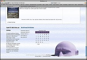
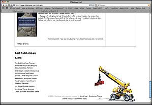
I have to say that I really like the delicious plugin (del.icio.us for WordPress, by Ricardo Gonzalez), but it didn’t quite look right in the Constructor theme that I am using. The heading didn’t match the rest of the theme headings, and there was text following the link names specifying when the link was posted, but it was indistinguishable, i.e. same style.

(Delicious.com, or del.icio.us,  is a social bookmark site, you can save bookmarks to the cloud and share them with your friends.  You tag the links, they’re searchable, your list of links is browsable, and the ability to access that cloud on your blog is a great little feature.)

Turns out when you look at the source code generated by the widget, it does have custom classes for these elements:

Delicious_title_link   -- the actual title used in the sidebar
Delicious-item    	--  the specific link list item
Delicious-link     -- the link itself
Delicious-timestamp  -- the time for the item (e.g. “36 mins ago”)

Fortunately, Constructor lets you add your own CSS rules to the theme in a separate CSS file that won’t be overwritten when you update the theme files. This is a great place for adding the rules you need.

So, I added the following to the css file, just to differentiate that time stamp with smaller italic text in a contrasting color, and to make the title link look like the other sidebar headings:

.delicious-timestamp {
font-size: smaller;
font-style: italic;
color: #2F608A
}

.delicious_title_link {
color: #2F608A;
}

Voila, now things match, and if I should build my own custom theme from scratch later, I can just lift these rules to accommodate that widget, or any other widgets with their own CSS classes.
Categories
Blog Web Design Web development

Theming WordPress – work in progress

Still working on theming the site and installing the plug-ins I want.

I ended up selecting the theme Constructor for now, which looks relatively nice out of the box.  The theme supports several different layouts, and lets you customize a lot of things.

StockConstructorSkin StockConstructorSkin2

Here’s the same theme with a few minor adjustments, mostly different background images and font tweaks:

MyConstructorSkin1 MyConstructorSkin2

I’d spent a bunch of time scratching my head over how I might do something similar to the legos/crane motif. Finally, I found something I could isolate and put into the theme, and just went with a simple photocollage for the header file. I played with a few backgrounds, and decided to go with a bright, fairly neutral glass texture. With a couple hours of Photoshop, now the page looks more like my old one.

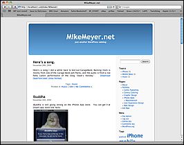
And, just for giggles, here’s what my test version of the site looks like with the default WordPress theme.  It’s quite boring, and requires you to shove everything off to the left side.

Boring. The only thing you can change visually is the color of that blue bar at top, you can't even just drop in your own header graphic.

I will say that I am struggling a bit with the flow of the content inside these posts, things really fall apart if you have more than one small graphic, it seems. Perhaps I’m not doing this the easy way, I did see that wordpress has a built-in gallery function for putting a bunch of graphics in a post, but they didn’t look so good to me. Suppose my next step is to RTFM before I blame the theme or WordPress. I also think that my articles are already proving to be too long for the front page, I should use excerpts, but not sure if the theme supports that. At the very least, I may need to override some more things in the style sheet.

Categories
iOS development iPhone Weaselfloss

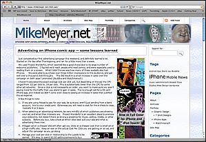
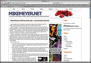
Advertising an iPhone comic app — some lessons learned

WM-Ad2-160x600

Just completed our first advertising campaign this weekend, and definitely learned a lot. Started on the day after Thanksgiving, and ran for a little more than a week.

We used Project Wonderful, which seemed like a good choice due to its large number of webcomic publishers.   I figured we’d reach people who read comics, and were especially used to reading them on a screen.   What I didn’t know was how many of these eyeballs also had iPhones.     We were able to purchase over three million impressions to this audience, and got well over a thousand click-throughs.    This did result in a small increase in sales over the campaign on both apps I promoted (iBuddha and Watchmensch).

I haven’t calculated the exact average cost per click yet, but depending on the ad, the CPC ranged from .02 per click to .18 per click.  This is substantially lower than the CPC for some other ad networks.   Since a click is not necessarily an order, you want to make sure you aren’t paying more for the traffic than you stand to gain in sales.  This is a tough call for a 99 cent iPhone app, and indeed we didn’t come even close to seeing an increase in sales that justified the ad expense.

A few things to note:

  1. If you are using Paypal to pay for your ads, be sure you aren’t just sending from a bank account,  link to your credit card.  Otherwise you will need to wait for the e-check to clear,  typically 4 or 5 days.
  2. When selecting an advertising network, be very mindful of which publishers are showing your ad, and what their interests are.   Project Wonderful is an excellent place to promote your webcomic, but doesn’t have as strong a presence for music, politics, media, or other subjects.   Before you buy, take a look at which sites best suit your ads and what is advertising there now.
  3. A bigger ad on a cheaper site will often get you clicks at a cheaper cost than a small ad on a high-traffic site.  Keep an eye on the actual Cost Per Click you are getting on an ad, and adjust the campaign as you go along.
    125 by 125 pixels is a pretty popular size, I went for the strongest visual from the bigger ad and the message from the smaller ad.  I thought the three sizes I made worked together nicely as a set.
    125 by 125 pixels is a pretty popular size, I went for the strongest visual from the bigger ad and the message from the smaller ad. I thought the three sizes I made worked together nicely as a set.
  4. Manage your cost-per-click in relationship to the upside to be gained.   It’s okay to spend $5.00 getting someone to buy something if you are selling something expensive, not so much for a 99 cent app (for which you will be paid 70 cents after Apple takes its cut).
  5. Few ads will inspire action on the first showing, in general the ad industry says that someone needs to see your ad about 27 times before they will act. Seeing as many people who read webcomics and game reviews visit multiple sites, and read them daily, you should try to stretch out your impressions to as many places and over as long a time period as you can, rather than buy 1 expensive high-traffic ad for a day.
  6. Alternating between the big ads on a site and smaller ads on the same site seemed to work nicely, and saved cash. You’ll want to design your ads so that the different sizes share graphic elements, branding, etc.
    This was the 117x30 version of the ad, the familiar logo made it eye-catching despite its size.
    This was the 117x30 version of the ad, the familiar logo made it eye-catching despite its size.
  7. Different ad networks have different pricing models. Project Wonderful prices ads by day, and you bid for the ad slot. Whenever your ad is the high bidder, it shows on the site. You are only charged for the time slices when your ad is shown, and you can put in an automatic bid, just like eBay. Project Wonderful will only bid up your ad to the minimum needed for you to win, subject to your daily spending limits and your max price for the ad. Other networks may ask you to pay per impression (generally a bad idea), pay per click-through, or pay per action (actual order on your site). Be sure you are comparing apples to apples when comparing sites.

So, overall verdict: not worth the money in sales, but pretty valuable lesson about how online ads work. I definitely will end up using online ads again, but as part of a wider strategy of getting reviews, blog links, etc. for the product. Advertising is no substitute for marketing, i.e. identifying your target audience and figuring out how to reach them.

Categories
Mobile News

Mobile blogging

Testing the wordpress 2 iPhone app with the blog. This is pretty handy, though frankly typing on a mobile keyboard is not my favorite thing.

Categories
Esoterica

This is “Your Brains” on ASL…

This song never gets old, and it’s even better in ASL:

Categories
Web Design

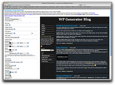
WordPress Theme Generator

I found an interactive page for generating wordpress themes at http://www.yvoschaap.com/wpthemegen/. It’s a very nice bit of Javascripting that lets you use your own logo image, control body size, sidebar location and size, choose a 2 sidebar or 1 sidebar layout, control the menu layout, and control all the colors. The result is a very lightweight wordpress theme with a minimum of images, though you certainly could further modify the CSS to add your own background graphics, etc..

Compared to my own interactive CSS manipulation scripts, this is an impressive bit of programming. The script not only generates the css styles, but also zips up a WordPress-complaint theme package that you can just drop into your wp-content folder. The theme is also Widget-aware and supports tags.

You can interactively pick the column layout, fonts, background images, and all the element colors.