Got caught by one of the gotchas in keeping things compatible between iOS6 and iOS5 devices.
While both iOS5 and iOS6 support UI Storyboarding (you have to forego this feature if you want your app to run on iOS 4.0 as well), iOS 5 does not support the new auto layout feature in iOS 6. Autolayout (which I hope to talk more about soon) has some very powerful features for making sure your screen layout works in different orientations, on the taller iPhone 6 screen, etc.
If you try running a program with autolayout enabled, iOS 5 will crash your app, as the OS doesn’t recognize the UIConstraint selectors needed to draw the screen. This is also a backward compatibility issue on Mac OS X — Lion uses autolayout, but Snow Leopard doesn’t.
Turns out, however, that when you create a new project in Xcode 4.3 and up, autolayout is enabled by default. However, there is a setting that lets you turn that off.
This is one of the issues iOS (and Android, for that matter) developers constantly have to think about — which new features do I use, and which do I have to forgo in order to support older devices? In my case, I will be running this program eventually on an iPad, and my 1st gen iPad is stuck at 5.1, so no autolayout on this project.
Learned something new today. If you’ve ever gotten a PDF form via email that requires a signature, it turns out that you can easily add that signature in OS X Lion or Mountain Lion using features in the built-in Preview program.
First off, open the PDF file in Preview. If you are running Lion, look for a toolbar icon called Annotate, if you are running Mountain Lion, it’s called Edit. Clicking on either exposes a tool bar of commands for editing your document. Look for the icon with the line and an S.
Signature Icon is highlighted in blue. The icon which gets you this toolbar is slightly different in Lion (Annotate) and Mountain Lion (Edit), but they do the same things.
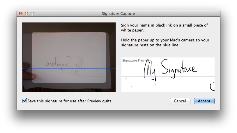
The Signature pulldown gives you the option to import a signature using the iSight camera. If you’ve already scanned in your signature before, it will also allow you to select it.
The signature pulldown.
All you need to do is write your signature on a blank piece of paper and hold it up. No matter what color ink you use, Preview’s image processing will turn it into a crisp black signature. You can save the signature for reuse later as well.
Note that Preview also made a crisp outline of my thumb, so watch the signature box carefully.
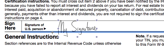
Once you’ve accepted the signature, you will see a crosshair cursor and a text box with your signature in it, you can move this as needed to any line in the form.
You can resize and move this signature image any line in the document. Clicking off the signature and clicking again will let you sign in multiple places, if needed.
Voila! Much easier than printing, signing and scanning, or printing, signing and taking photo, or even digging out one’s stylus. Just be careful about saving your signature for later if you share the computer with others and aren’t using separate login accounts.
Note also that this Annotate/Edit tool lets you fill in text fields on the document as well, so it’s a good way to fill out documents that might not be set up as forms.
You can’t argue with their logic, but you have to wonder why the big discrepancy.
One area that screams opportunity is that it was taking them about 3-4 extra days to author the magazine for their Android targets, compared to a few hours to adapt their Retina iPad version to non-retina iPad and iPhone versions.
If you have an authoring platform that easily can generate for all the targets without manual intervention, then it really doesn’t matter how small your Android audience starts out. This seems to be the issue, that they built for the retina iPad, then ‘dumbed down’ the content to hit a broad range of Android devices. They use the Mag+ platform to publish their magazine. It starts with InDesign, and maybe that’s part of the problem. There’s a pressing need for a publishing workflow that is more organic to mobile rather than based on print content.
The other issue seemed to be discoverability — there is one place in iOS where Magazines are showcased (Newsstand), and they are also discoverable in the App Store proper. On Android, you have multiple app stores — Google Play, Amazon, and whatever storefront the carriers may have added. This means you need to submit your app to multiple stores and try to get it showcased there. If Apple has 100,000 downloads of your app, it will show up in popularity rankings, but that same 100,000 will be diluted across multiple stores on Android. And given the split they saw, it’s really 1250 downloads spread across Google Play, Amazon, Verizon, etc.
iOS 6 also has a feature that will tell you if there is an app for any sites you visit in Safari, and that certainly must drive downloads as well. The feature is called “Smart App Banners”. You basically put a meta tag in your web page that tells Safari about the app, and voila, a banner with an App Store link is visible to any Safari users using iOS 6. Android doesn’t have a similar feature.
RealMac Software’s Clear, introduced a fun, minimalist to-do-list manager that you’ll actually use. As an added bonus, version 1.2 includes iCloud syncing, and there’s a companion desktop OS X version as well. The gesture-based interface is easy to learn, fun to use, and includes very satisfying use of color and sound to reward you for washing the dishes, feeding the cat, etc.
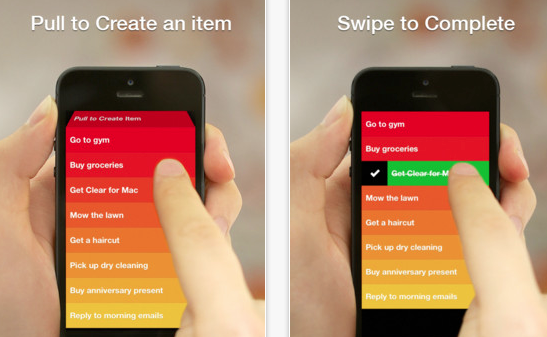
Clear's gesture-based interface makes it fun to check off your chores.
This is hands-down my favorite app purchase of the year, an app I use nearly every day, and one only made better with the addition of iCloud.
Sketch Club: This inexpensive, but powerful drawing program has had several important features added this year: improved brush handling, the ability to record your drawing process, and improved sharing features. Add in the online community with the app, and it’s a great buy at $2.99.
Propellerhead Figure: Sure, it’s just kind of a toy compared to the excellent desktop music package Reason, but man is it fun, and the music engine underneath sounds great. This has also evolved new features since its launch, like export of sound files. I’ve spent 99 cents on worse apps, including my own. I hope that Propellerhead extends their line to make other apps of this type, perhaps something more like a sketchpad for capturing music.
Evernote 5.0: Evernote gave its app quite an overhaul on both desktop and mobile. While the redesigned desktop client seems to make a bunch of commands much harder to use, the mobile version is much more streamlined and polished.
Hall of Meh:
Google Maps: The UI is not nearly as intuitive as the old Apple-developed Maps app, the typography and layout stick out like a sore thumb, and the app asking for you to sign in with your Google identity doesn’t serve any purpose that helps you. Lack of address book support is a big step backwards, too. You may find it a must-have app, particularly if Apple Maps isn’t working well for you, but it really seems like a half-hearted effort from Google.
Paper (iPad only): Sure, it’s gorgeous, but its sketchbook UI paradigm gets in the way fast. The pens are responsive and aesthetically pleasing, but the pricing model of purchasing them individually at $1.99 makes this a very expensive drawing program considering its limitations. The lack of being able to pinch to zoom on the pages, along with the lack of layer support, make this package pretty much useless for anything but simple doodles. Also, the reliance on gestures makes it less intuitive than you’d think.
Facebook: While getting rid of their HTML5-based mistake was a good step in the right direction, the new version still lacks the elegance of the original native version, and the addition of advertising that can’t be filtered out only serves Facebook’s bottom line, not the user.
We’ve all been busy with the last-minute shopping, travel, cooking, and hangover cures, so here’s a rundown with lots of “Best Of” lists, predictions, etc. for the end of the year.
This piece from TechCrunch talks about how the lower advertising return on mobile will affect future sites and products.
One of the big benefits to upgrading my laptop to OS X Mountain Lion was the ability to finally have all my contacts, calendars, etc. synced on iCloud. This was a big obstacle for me, I had one Mac on iCloud, but most of my email meeting requests and new contacts coming in through my Snow Leopard machine.
The biggest benefit to making the upgrade, however, is the ability to take advantage of apps that fully embrace iCloud. I’ve been using Realmac’s To-Do List manager Clear for a while on iOS. It’s a stellar app for the job: most iOS To Do list managers are overly-complicated, but Clear just lets you make lists, add items, and delete items. You don’t need to be familiar with GTD (Getting Things Done) or any other methodology. You don’t need to have read a book describing a system, you don’t need to register on a web service to sync with your PC. In fact, up until Version 1.2 of Clear for iOS, there was no desktop syncing, and that was OK, because the app is just so elegant for what it does do.
For those who haven’t used it, Clear is mostly gesture-based — you check off tasks by swiping on the list item, you go up and down the hierarchy of lists and tasks using pinch gestures, you can add an item either with pull to refresh or with an open pinch. All of these actions are accompanied by sound queues, and the task lists are sorted by a gradation in background color. The standard color scheme is a ‘heat-map’ which puts high items in the list in red, and lower items in gradations of orange and yellow. Completed items turn green before they disappear. It’s a very satisfying way to interact with a task list, for those who love the process of checking off their tasks.
RealMac introduced a Mac OS X version of the app in early November 2012, and with this version came an update to the iOS version enabling iCloud as well. The OS X version uses most of the gestures of the iOS version, but adds the ability to look at multiple lists at the same time, and drag tasks from one list to another, and also use keyboard shortcuts for many functions. It’s not a perfect adaptation, some of the gestures are a little clumsy when you do them on a trackpad, but for those familiar with the iOS version, it’s easy enough to adjust. On OS X, the Clear interface is simple, takes up very little screen real estate, and is very handy for jotting down quick lists. On my laptop or desktop, I find myself using it whenever I need to remember a quick list, it’s much more accessible than even Evernote for those ephemeral lists you actually expect to complete.
The big advantage of Clear across the cloud is that iCloud really ties the mobile and desktop versions seamlessly, and in a user-friendly fashion. Whenever you change a list on your handheld or your desktop, you get immediate feedback on that device, but also get audio feedback when the change is propagated through iCloud. It becomes completely obvious when it is or isn’t working. You don’t have to think about it.
This is a great example of the power of iCloud, with a sensible implementation that gives the user good information about what is happening while being completely unobtrusive. I now have these lists synced between my mobile devices and computers at all times, which makes them much more useful.